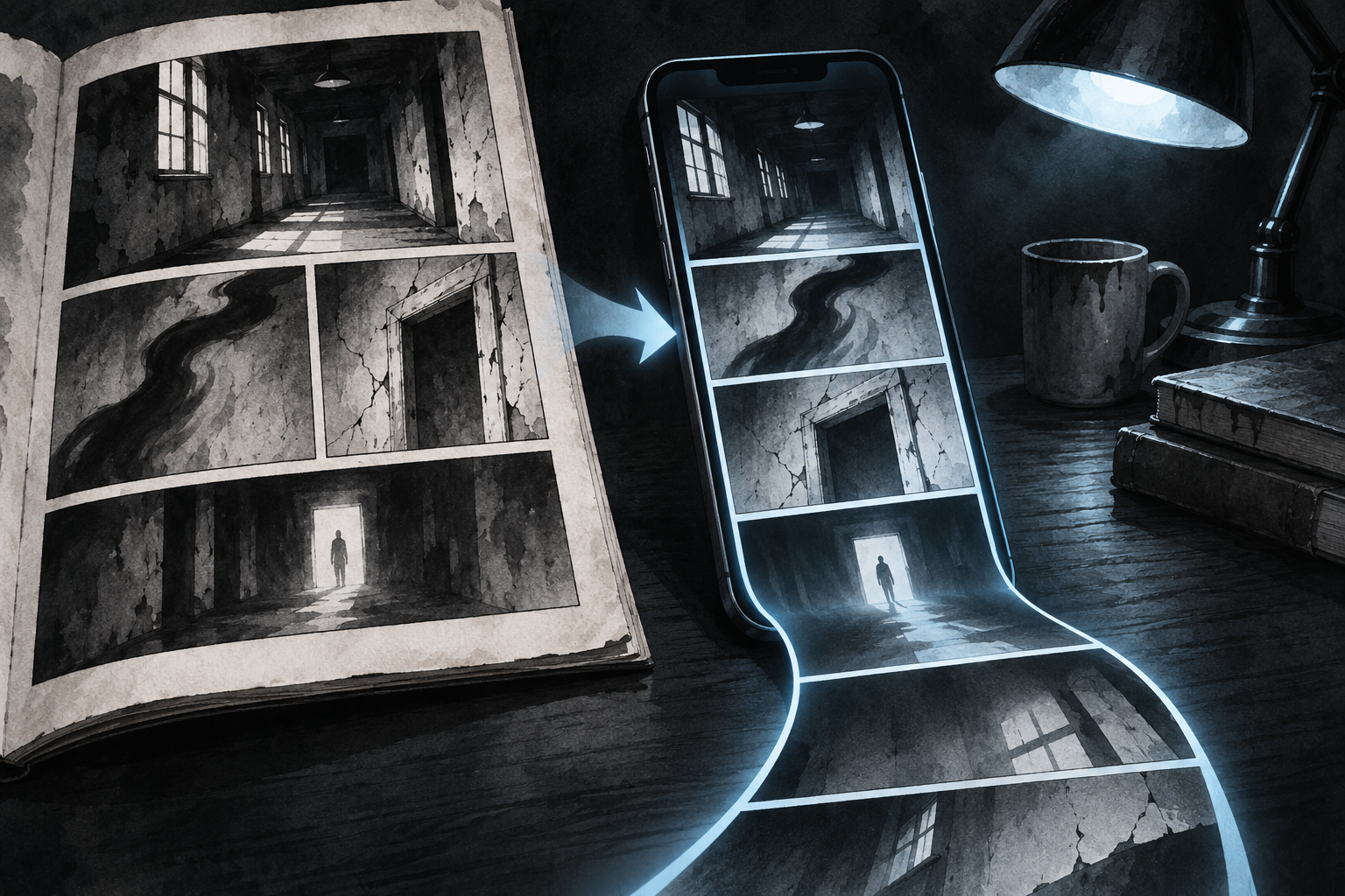
Naver has reformatted 이토 준지 걸작집 (The Junji Ito Masterpiece Collection) for vertical reading. The experiment shows how moving from a page to a phone changes timing, surprise and the reader’s control.
Junji Ito’s horror has always depended on when the reader is allowed to see the next image. A page can conceal a revelation on the reverse side, crowd several panels into one field of vision or force the eye toward a final corner.
Now that timing is being rebuilt for a screen.
Naver Webtoon began releasing 이토 준지 걸작집 (The Junji Ito Masterpiece Collection) as a vertical-scroll webtoon on October 30. The Korean service is starting with 토미에 (Tomie) and plans to add other representative stories from the collection. It is the first time Ito’s work has been presented in this format.
The result is more than a file conversion. It is a test of what happens when a page-based classic enters the reading grammar that Korean webtoons helped normalize.
The reader no longer turns the page
In print, the page is a fixed stage. Its size, panel arrangement and page turn are part of the composition. A reader can glance ahead, move backward or take in several images at once.
A vertical episode replaces that stage with a sequence. The screen shows only a portion of the work. Space between panels can delay the next image. A long downward movement can create suspense, while the speed of a swipe can collapse it.
Ito described that difference in Naver Webtoon’s announcement. With a printed page, he said, five or six panels can enter the eye at once, so a startling image often has to be hidden on the next page. In a webtoon, new images continue to appear as the reader scrolls, creating more freedom in the direction of the scene.
That freedom is not automatic improvement. The same scroll that conceals an image can make composition feel narrower. A splash page loses its simultaneous scale if it has to be broken into screen-height fragments. A reader can also rush past carefully spaced beats.
The useful question is therefore not whether vertical scroll is better than print. It is which kind of fear each form can produce.
Why 토미에 (Tomie) is a revealing starting point
토미에 (Tomie), Ito’s debut work, is built around recurrence. Its central figure is destroyed and returns, multiplied and still exerting control over the people around her. Repetition is part of the horror.
That makes the story suited to serialized digital discovery. A reader can encounter a sequence of returns one screen at a time, while the service can release a familiar backlist title as an ongoing event rather than a static archive.
Naver is publishing the collection through its 매일+(플러스) (Daily Plus) program and Naver Series. The company is not simply digitizing an unavailable work: an 11-volume Korean ebook edition already exists on Naver Series. The new value proposition is the reformatted experience.
That distinction matters for readers deciding where to begin. The ebook preserves the page-based edition. The webtoon version foregrounds pacing designed for a phone. They are two presentations of the same stories, not interchangeable copies.
A format can make an old catalog newly visible
The release had an immediate discovery effect. The page-based 이토 준지 걸작집 (The Junji Ito Masterpiece Collection) reached No. 1 on Naver Series’ daily comics Top 100 in an in-period snapshot, ahead of current Korean and Japanese serials. That is a platform ranking, not a national sales chart, but it shows how a new format can return a completed backlist to active browsing.
This is a familiar digital-publishing strategy with a more ambitious editorial step. Platforms often use discounts, free chapters or adaptations to revive older work. Reformatting changes the reading object itself.
For publishers and creators, that creates both an opportunity and a warning. A strong backlist can find a new audience without waiting for a screen adaptation. But the conversion has to respect the visual logic of the original. Cropping, panel separation and added vertical space become editorial decisions with consequences for authorship.
What readers should look for
The most revealing comparison is not cover art or image sharpness. It is timing.
Where does the vertical version insert empty space? Which images are held back until a swipe? Does a scene that felt crowded on the page become more controlled, or does it lose the pressure of seeing several disturbing details together? Does the phone make the work more intimate, or simply smaller?
Those questions apply beyond horror. Korean platforms are increasingly places where print manga, webtoons, webnovels and screen adaptations meet. Each move changes not just distribution but the sequence in which a reader receives information.
Ito’s collection makes that change unusually easy to see. His work already treats the page as a machine for controlling attention. The vertical edition rebuilds the machine and hands part of its timing to the reader’s thumb.