We have recently chosen the “Best Book Designs in Korea.” As each book is beautiful in its own way, it is meaningless to line them up based on a fixed standard. However, selecting books that have best represented the beauty of the generation breathes life into it and makes it meaningful once again. In order to choose the best book designs, we put our heads together to select the right judges. We received opinions from various fields and invited five judges among them, who were Moon Janghyun, Park Yeounjoo, Park Hwalsung, Jin Dallae, and Choi Sulki. We posted an announcement about the contest and received submissions. We also asked those who made the books recommended by the reviewers from various fields to submit their books. Ten books made it to the final, and each of the judges gave a precious, carefully written commentary to all the winners.
The chosen books from this year’s fair will go to Leipzig, Germany. There, the winners from Korea will be meeting books and people from other countries and compete for the “Best Book Design from all over the world 2021.” They will also meet readers at the Seoul International Book Fair and Frankfurt Book Fair. Designer Ahn Sang-Soo who was a judge of the contest several years ago, designed the medal, on which he engraved the phrase “The Sun Shines at Night.”
Poet Lee Seong-Bok spoke of the nine levels of beauty, quoting a book from the past, “There are the top three levels. The third level is white snow inside a white silver bowl, where the beauty comes from sameness where things akin go along together. The second level is white snow covering the mountains except for the black, highest peak, where the beauty comes from difference. The first, highest level is the sun shining at midnight, where the beauty comes from a paradoxical, unrealistic phenomenon, standing on the boundary of reality and unreality.” While it is impossible for books in the physical world to surpass reality, designer Ahn carved the phrase dreaming of it.
The ten books chosen for the “Best Book Designs in Korea” were as follows:
- New Normal (6699press)
- FEUILLES (Mediabus)
- ㅁ (organpress)
- The Journey of Arita (Ann Graphics., Ltc.)
- thisisneverthisisneverthat (Workroom Press)
- IN THE SPOTLIGHT (IANNBOOKS)
- A Grid Eraser (OEumil)
- The Flow of Words (Delta Time)
- THE ESSENTIAL GEORGE ORWELL (Minumsa)
- and The Note for Revolution (Alma Inc.)
The first six books were about visual art from a broad perspective, while they were sub-divided into art, fine art, design, photography, and fashion. Here, if we consider how the poem collection A Grid Eraser put emphasis on the design, adding to its experimentation with text, a total of seven books with creative designs have topped the chart. Selecting such special books can be likened to the talented Olympic athletes competing against each other after receiving special training. Well, they expect quite similar results as well.
The Olympics have been postponed for a year due to the pandemic, and it is still uncertain whether it can be held this year. This global event is where the competition of elite athletes takes place. Professional Athletes in sports such as track & field, swimming, martial arts, and ball games participate in the Olympics. The amateurism from the early Olympics has faded, and now there will be few Olympics participants that do not make a living out of their specialty in sports. Nowadays, athletes seem to attend the Olympics to test their limits. A 100-meter sprint does not determine the economy or fate of a country nor the world. However, the runner’s condensed effort put into shortening the record by 0.001 seconds is beautiful as it is, and no matter what the result may be, it encourages the runner to take on the next challenge.
Even though we are focused on being “special,” we are not asking all the books that support this world to be so. We lean more to the hope that such “special challenges” can lead to various accomplishments in other fields. Following are the “challenges” taken on by the selected “Best Book Designs in Korea.”
Judge Choi Sulki thought that the book New Normal had a firm structure.
“While the paperboard is thin, it is rigid and does not bend. The front and back covers are perfectly symmetrical, and the spine of the book is a rigid rectangle without any crooked areas. The material used for the covers feels like soft knock-off leather, but does not feel cheap and clings to your hand satisfyingly.”
She chose the beauty of printing, the delicacy of the papers’ color, the appropriateness of the materials, and the neatness of the fonts as the virtues of the book. She chose this book after carefully going over each of the elements mentioned earlier, which are indeed hard to manifest into design when undergoing mass production, even with the specific guidelines of the designer.
Her second pick was A Grid Eraser, where she gave extra points to the various challenges taken on by the couple – a poet and a designer – where they combined the content and format of the book. Usually, designs of books aim to reflect their content and, in many cases, try to create an elemental synergy with it. But many of the attempts fail, as they do not mix with each other well. Honestly, many editors do not fully understand what the book they are working on is talking about and struggle to edit the text. It would be no different for designers as they seldom digest the text thoroughly and continue on to other design experiments. However, if they have put in such efforts, they deserve to be valued.
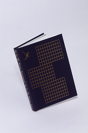
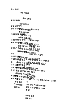
New Normal, A Grid Eraser
Judge Moon Janghyun chose FEUILLES, acknowledging the designer’s efforts which kept the design compact.
“There are already so many design-related techniques floating around that almost nothing is truly original anymore, and there are many examples of book designers becoming overambitious and going over the top to express their ideas. This book provides a good example of designers who resisted the urge to be overambitious and produced a vividly designed book. The designers’ success can be felt in this extremely simple composition that makes every aspect of the book’s content feel like it is in its proper place.”
As the art brochure of artist Eom Yu-Jeong, the content of the book is visually attractive materials. On such occasions, it is common for the designer to focus on how to present their works to the viewers. However, she chose different papers for different works, even taking the weight and texture into consideration. Her strategy of moderation to not make the bowl too excessive and spoil the taste of the food inside has kept the book’s beauty intact.
His other pick was thisisneverthisisneverthat. The work vividly shows the story of the 10-year-old fashion brand in a simple editing style where “all” of their products are arranged in a list format. Even without using a metaphor or adopting a mechanism to stand out, the book’s indifferent but candid way of exhibiting the works gives off a confident “power.” This book, which, borrowing Moon Janghyun’s comment, showed what an archive is, received a good grade for proposing an effective way of presenting visual materials as content.
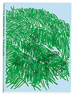
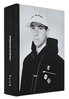
FEUILLES, thisisneverthisisneverthat
Meanwhile, what judge Park Yeounjoo thought highly of ㅁ (“ㅁ” is one of the consonants in the Korean alphabet) was the harmonious balance of the publishing plan, editing style, and design. The multi-layered publishing plan where the content written in various languages with authors from different fields is translated into Korean and English, the editing strategy where the big book preserves the original language and the small book contains the translations and the artistic design where the graphics, fonts, and space between letters of the original writers are kept formed a harmonious trinity, implying that they are the conditions of being a beautiful book.
Also, The Journey of Arita (“Arita” is the name of a font made in Korea) features the records of designers’ endeavors and accomplishments as they develop fonts for Hangeul, the Korean alphabet. Its publishing plan, editing skill, and design were evaluated to have made a good blend.
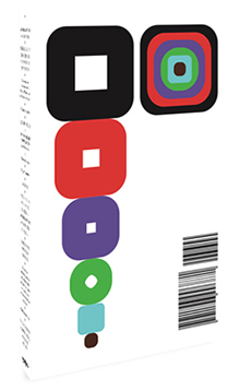
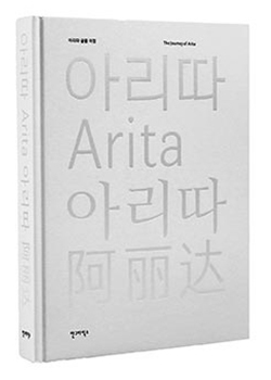
ㅁ, The Journey of Arita
Judge Jin Dallae marked the editing and design strategies of IN THE SPOTLIGHT.
“‘Intersection’ is the main thread that runs through this book in terms of editing and design. The front cover is red, and the back cover is blue, seemingly symbolizing North and South Korea; however, both covers are left neutral and unclear because there is no written title to be seen. Therefore, the front and back covers appear to represent the intersection between North and South Korea as well as the start and end of the book. Moreover, on top of the strong red and blue colors, many shining lines intersect a circle and collide within it to form a star, as if following the movement of a pendulum. This can remind us of the spotlight on an empty stage, but also make us imagine external gaze trying to read the systems and ideologies symbolized by stars.”
When making a book of loud visual content, the determinant of a successful design is usually how strategically the images are arranged. Sometimes, it is hard to distinguish whether the beauty of such books comes from the content or the design. In many cases, people often neglect the thoughtful consideration enclosed. However, she tried to read their struggles and considerations in this year’s contest.
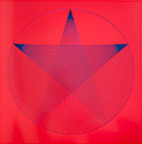
IN THE SPOTLIGHT
Unlike the aforementioned seven books, the remaining three books were “trade books,” which can be easily found in bookstores and widely enjoyed by readers. In Korea, a publishing powerhouse where tens of thousands of books pour out each year, it is never easy to look over all those books and select a few among them. In particular, the content, editing style, and design should be in an organic order to succeed as trade books. And looking into each element is also a very challenging task. So, even within the small scope of books submitted for the contest, she carefully looked through the content along with their designs and referred to the context of publishing embedded within.
Judge Park Hwalsung commented about how The Note for Revolution closely connected editing and design as below.
“This book, which is made up of 119 short yet sharp works of writing and their annotations, places annotations on the same place as the main text, an act that tacitly and explicitly overturns the hierarchy typically expected of texts and, moreover, changes the very rhythm of reading.”
The Flow of Words was chosen with extra points for being a series.
“This series, which encompasses over 10 volumes and is filled with words that feed off each other that make it deserving of being selected, clearly demonstrates planning on the part of the publisher and that the design of the books was based on those plans. The front and back covers, which use English typography made up of the beginnings and ends of words, do a good job of exemplifying the concept of the series, and the soft cover edition and the paper used for the main text to give off a light feeling, were both appropriate choices for this series’ lighthearted and easy-to-grasp content.”
THE ESSENTIAL GEORGE ORWELL would not have been chosen if the judge did not reach the idea that the book reflects the generation.
“The Essential series, which could easily be seen at first glance as an improved version of old classics, must be evaluated within the context of the Korean publishing world’s current situation and its capabilities, and therefore this book’s design must also be seen in the same light. It is difficult to summarize this book’s design in simple terms because it is the accumulation of the past and the present and analog and digital cultures. This difficulty is borne from the fact that restoration, reinterpretation, tradition, and new attempts are all mixed within the book’s cover design, including the front cover illustration, the composition of the main text, the choice of fonts, and the use of typography.”
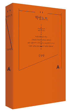
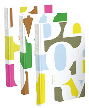
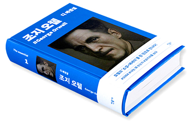
The Note for Revolution, The Flow of Words, THE ESSENTIAL GEORGE ORWELL
In this article, we talked about how the ten “Best Book Designs in Korea” were chosen. The winners have already been collected and sent to Leipzig with commentaries. However, COVID-19 is delaying the moment these books will meet other winners on the global stage. Book fairs across the world are canceled, postponed, and held online. There are no book fairs where the publishers and readers get to meet in person. Recently in Buenos Aires, tens of publishers organized a place outdoors and met readers though the size was limited. Book fair directors across the world envied them. Nobody knows whether the screening process would flow as smoothly as a river, but selecting the most beautiful books will continue every year. The Seoul International Book Fair, carefully preparing to meet readers, is scheduled to be held from September 8th to 12th for 5 days at “S Factory” in Seongsu-dong, Korea. The exhibition will be packed with the books mentioned above with beautiful book designs in Korea, and those that will be chosen at Leipzig. Don’t miss the chance where you can see all the challenges and accomplishments of Korean books at a glance, striving to take a step closer to beauty.
Written by Joo Iroo (Chief Executive Officer of Seoul International Book Fair)
Source. Seoul International Book Fair
